There are many calendaring components in the IBM portfolio. When I was assigned as the interaction designer the views (e.g. Month, Week, Day, etc.) were old and out of date. Collaborating with a visual designer, I worked to improve the visual presentation and the overall all usability of the views.
Visuals
We worked to make the look of the calendar more modern and the colors subtler. We also had the text on the entries wrap and dramatically decreased the left margin, making it easier for users to see the entry (you can see the before and after below).
Usability Improvements
Some of the usability improvements I championed included:
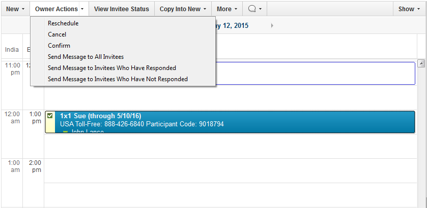
- Making actions available from the view. Previously, users had to open the form to take an action, but I argued that users wanted to take those actions directly from the view.
- Enabling users to color code entries based on tags.
- Swapping the time zones so the local time zone is closer to the entries (based on customer feedback).